Tunzafun
Primarily a Mini Golf course, Tunzafun over the years has expanded, therefore required a new identity and visual language to cater for the numerous rides they now house while still appealing to a broad, gender-neutral market.
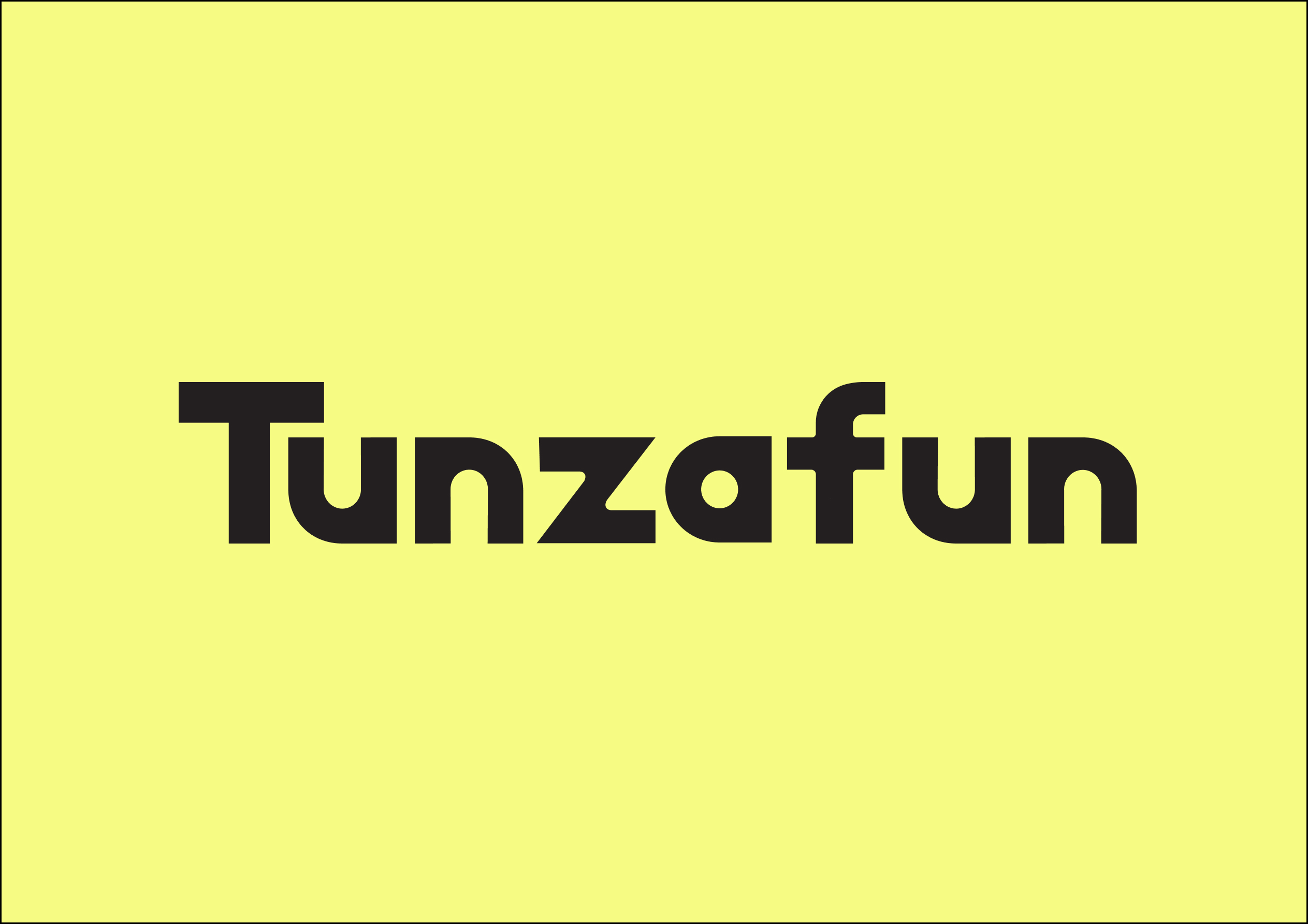
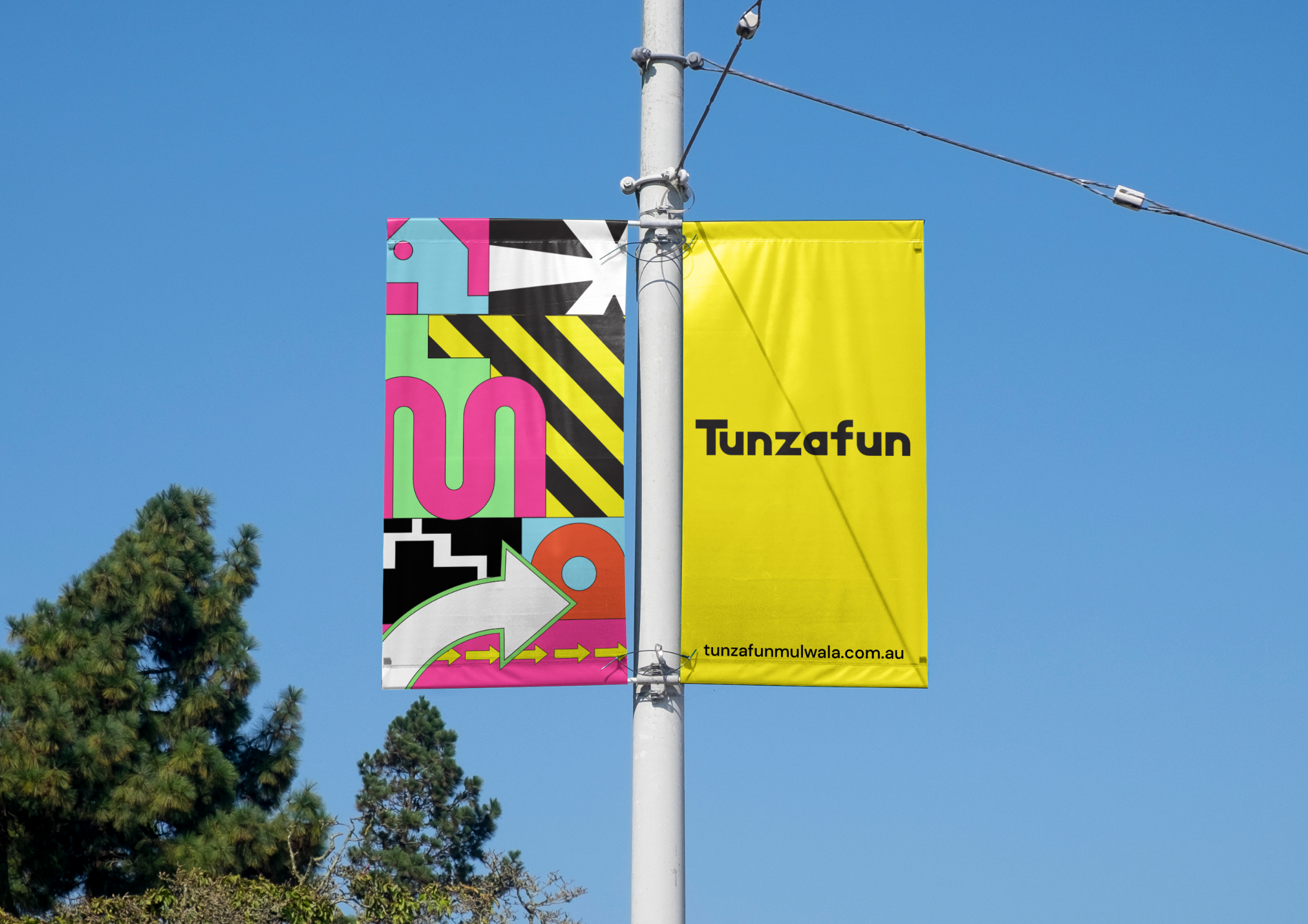
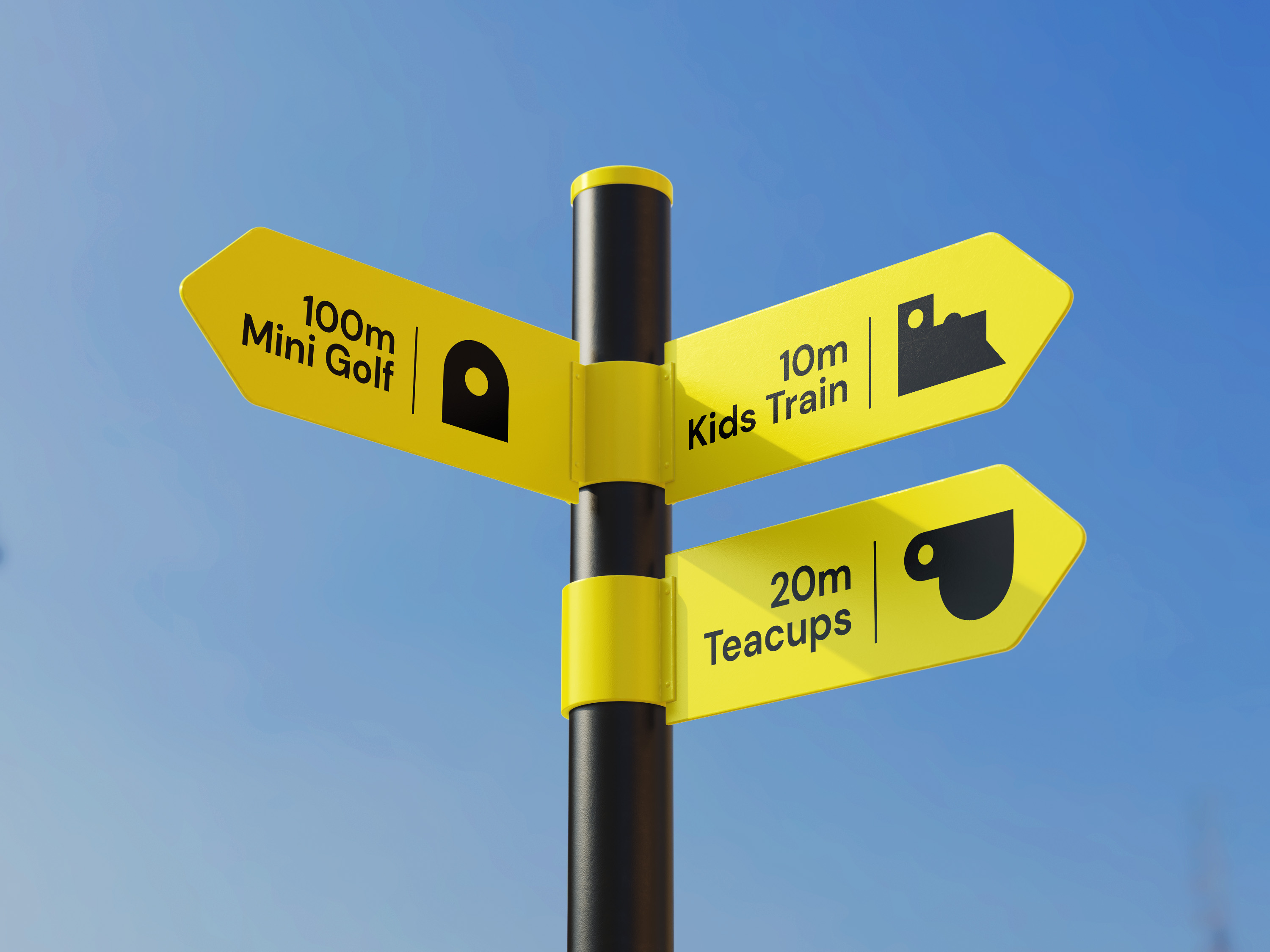
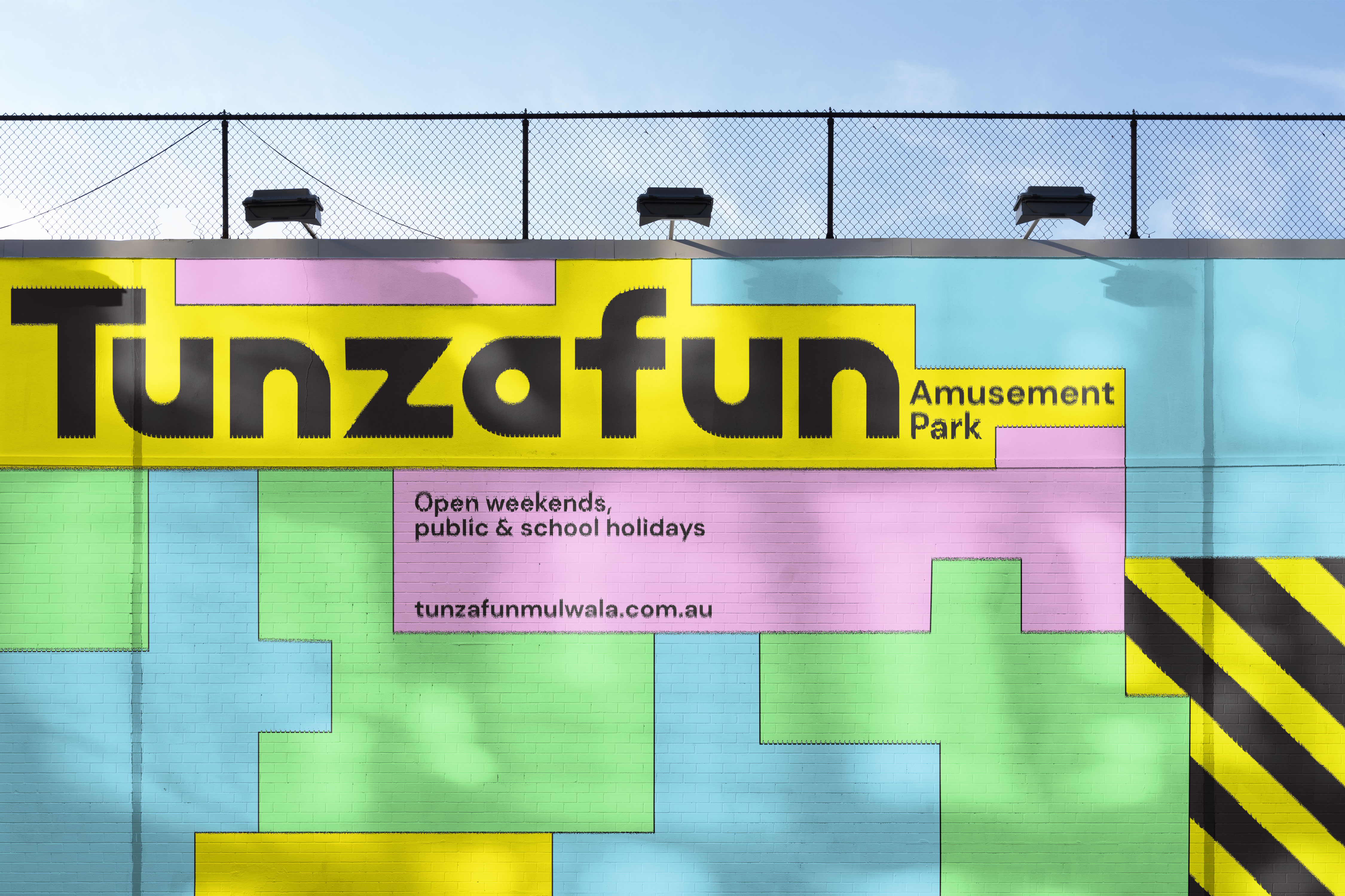
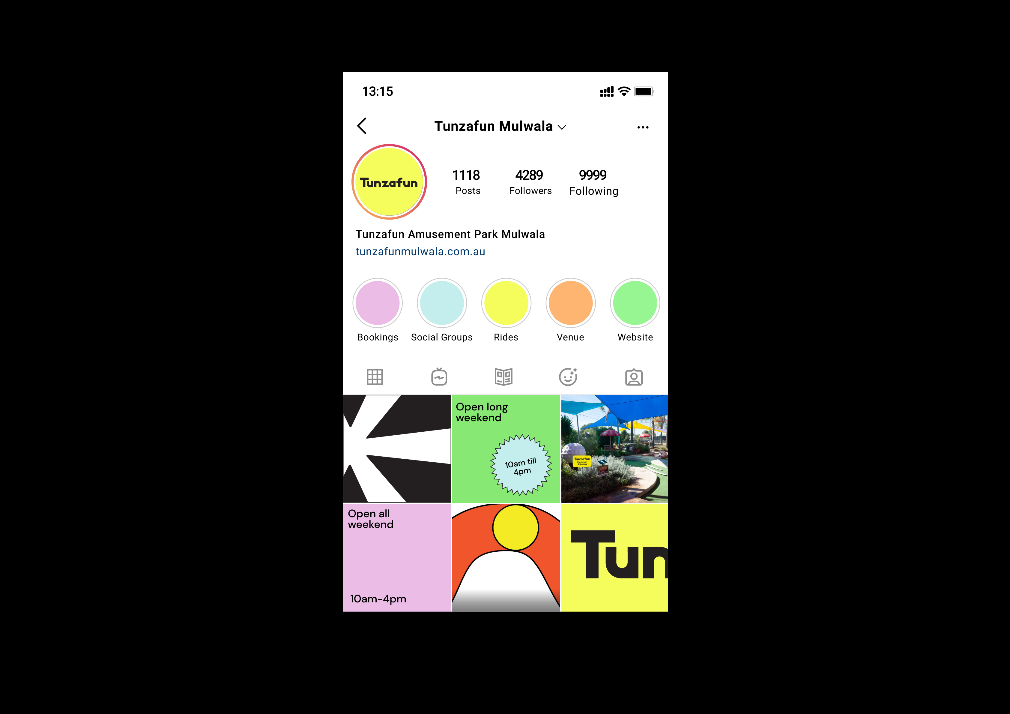
The new logo utilises the ‘a’ as the foundation for the brand identity. The a symbolises the mini golf hole as this is still the main attraction within Tunzafun. A visual system for each ride was then developed, using a similar geometric/retro style to create an easy to understand visual language for all. The colours played on a mix of gender-neutral tones, while still allowing the identity to be bright, colourful and visually appealing when driving past.
The new logo utilises the ‘a’ as the foundation for the brand identity. The a symbolises the mini golf hole as this is still the main attraction within Tunzafun. A visual system for each ride was then developed, using a similar geometric/retro style to create an easy to understand visual language for all. The colours played on a mix of gender-neutral tones, while still allowing the identity to be bright, colourful and visually appealing when driving past.
Branding and Identity
Graphic Design
︎︎︎ Animation: Zane Flynn
Graphic Design
︎︎︎ Animation: Zane Flynn
2021
